

I was Blank Street’s art director during their most rapid growth period. I built their visual identity and met retail, marketing and digital design needs as they grew from small-format coffee shop to $500 million lifestyle brand.


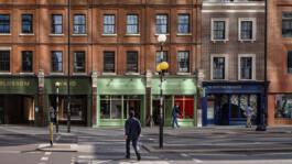
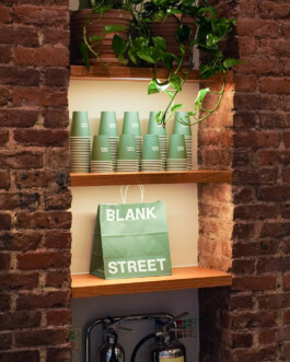
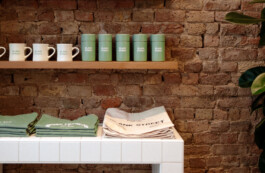
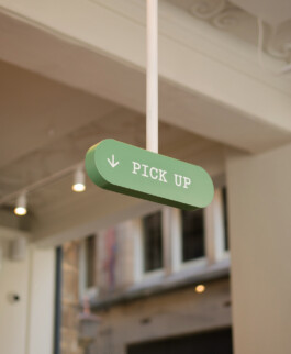
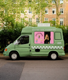
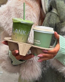
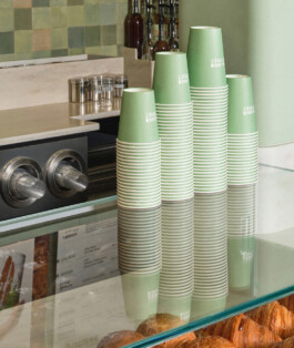
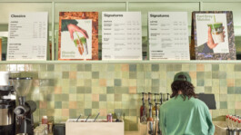
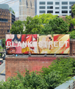
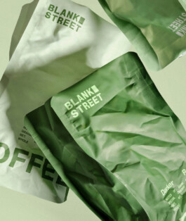
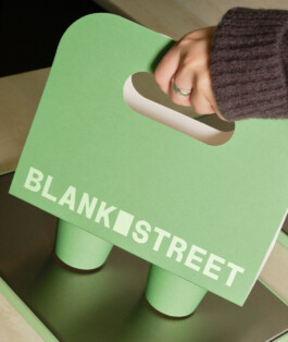
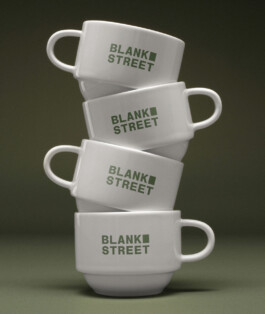
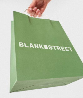
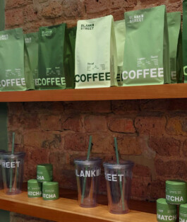
When I joined the team, Blank Street was known for selling low-price specialty coffee out of carts and micro-cafes in Brooklyn. The brand was sparse: black & white interiors, sans-serif wordmark and a green cup.
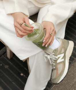
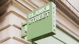
The cup stood out to me - the deceptively simple design felt like it could be the keystone of an iconic identity.
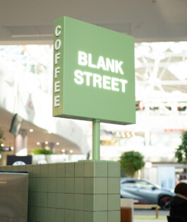
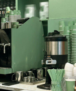
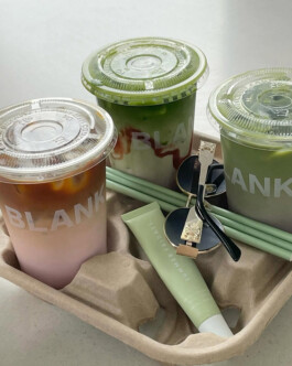
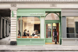
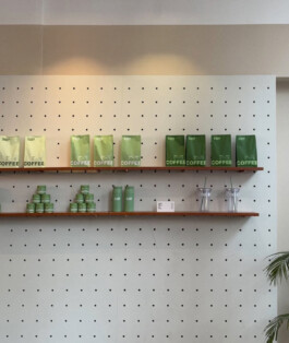
My first move as designer was to double down on the cup's earthy, soothing color. Over time, I applied it to packaging, storefronts, interiors and even straws, eventually making it Blank Street's most unmistakable signifier.


Whether it was the innovative flavors, strategic partnerships or that unmistakable green, Blank Street broke through in 2024, becoming a global phenomenon and reaching a $500 million valuation. Breathless reviews went viral on TikTok, the brand became synonymous with a desirable lifestyle, and the iconic cup was now a ubiquitous accessory for rising influencers and established celebrities alike.


With this rapidly expanding audience and a new confidence in our brand vision, we decided to refine the identity further. Partnering with Wolff Olins, we embarked on a comprehensive brand refresh - not to do a 180, but in order to become more ourselves.
The result was a new creative north star - the idea that Blank Street exemplifies the “regularly remarkable”. It’s high and low. Utility and indulgence. Sophistication and playfulness. It’s that routine thing that somehow makes the day a little extra. This idea allowed us to crystallize the tensions that made the brand interesting into a more cohesive, sophisticated visual system.


At the heart of the refresh was the window - a rectangular form matching the dimensions of the original cart window, a blank space of possibility. The color palette widened to include a spectrum of greens, inspired by the shades a Blank Street takes on in morning, afternoon and night. A type system was built around the everyday “Regular Sans” and display-oriented “Remarkable Sans”, and the art direction shed F&B conventions in favor of fashion and editorial-inspired imagery.


I implemented the refreshed brand across all touchpoints - from takeaway packaging to campaign direction. The window began appearing in varying contexts throughout the brand, and the newly expanded green palette was inagurated with color-coded roast bags. Campaigns took on a fashion forward, lifestyle-focused approach, and paper goods were designed in tandem with product packaging, so the brand experience felt more cohesive and thoroughly Blank Street, both inside stores and beyond.


